The narrative framework “Past Reveals Future,” presented at the Maison & Objet 2026 fair, reshuffles priorities in interior decoration. The focus is no longer on choosing a palette or a style, but on the ability of a space to incorporate objects that carry memory, transformed materials, and finishes that embrace their history.
Warm Minimalism: the structure behind the 2026 decor trend
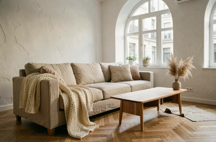
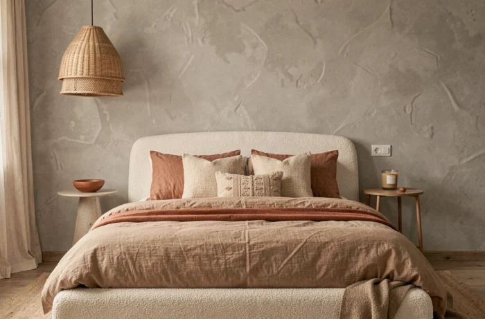
Warm Minimalism is not just about replacing gray with beige. We are witnessing a paradigm shift in the treatment of volumes: the lines remain clean, but each surface gains texture. Lime plaster, brushed wood, crumpled linen on seating. Cold minimalism, characterized by white planes and lacquered furniture, is clearly receding in favor of pieces whose materiality is tangible to the touch.
This approach imposes technical constraints. A wall with troweled plaster requires a perfectly prepared substrate. A matte finish porcelain stoneware floor demands careful layout to avoid unsightly joints on large formats. The result may seem simple, but the implementation is not.
To delve deeper into this shift towards textured and warm interiors, decor inspirations on Concept Maison allow you to visualize how these principles unfold room by room, from the living room to the bedroom.
Cloud Dancer and earthy palettes: choosing your living room paint in 2026
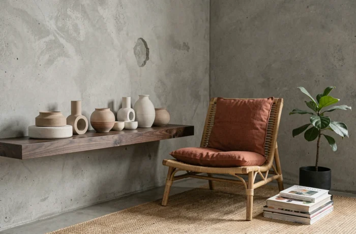
Pantone color 2026, Cloud Dancer (11-4201), confirms the abandonment of bright whites. This warm, slightly creamy white serves as a neutral background for accents of terracotta, amber, or deep burgundy. The cold grays and pristine whites that still dominated paint catalogs a few seasons ago are in clear decline.
We recommend working with color in layers rather than in opposition. A living room entirely painted in Cloud Dancer gains depth if the ceiling receives a slightly deeper shade (sand, greige) and the woodwork remains in the same color family. A common mistake is to place a saturated accent wall against a background that is too white, creating an artificial contrast.
Successful combinations for wall paint
- Cloud Dancer as a wall base, paired with textiles in golden ochre and brushed brass accessories, for a bright living room without coldness
- Terracotta on a single wall (behind a bookshelf or headboard), with the rest in sand tone, to anchor the room without darkening it
- Matte burgundy as a wainscot in a dining room, with discreet botanical patterned wallpaper above, for an enveloping effect
Warm neutral tones age better than pure whites, which yellow under certain LED lighting. This technical detail increasingly guides renovation prescriptions.
Recycled materials and heritage style: what home decor borrows from the past
The theme “Past Reveals Future” pushes the logic of creative recycling well beyond just a thrifted piece of furniture. In 2026, visible repair becomes an aesthetic choice. Ceramics re-glued in the style of kintsugi, reclaimed wood retaining its signs of use, patched fabrics integrated into contemporary textile compositions.
This trend, referred to as heritage style, should not be confused with vintage. Vintage reproduces or collects past forms. Heritage style embraces transformation: an industrial cast iron base supports a solid oak top made from demolition beams, with nail marks remaining visible.
Wood, linen, ceramics: natural materials in interior decoration
The return of raw materials is not cosmetic. Unfinished wood, unbleached linen, and artisanal ceramics meet a measurable durability requirement. An oiled oak tabletop ages beautifully over time instead of chipping. A raw linen cushion withstands dozens of washes without losing its shape.
The challenge lies in harmonization. Mixing too many raw materials in one room creates a cluttered effect rather than a curated one. We recommend limiting visible natural materials to three per space: for example, wood, linen, and stoneware for a living room, or rattan, cotton, and terracotta for a bedroom.
Wallpaper and flooring: surfaces that change the ambiance of a room
Panoramic wallpaper remains a quick transformation lever, provided you choose a pattern compatible with longevity. Oversized botanical prints, ubiquitous for several seasons, are starting to feel dated. References that hold up better over time focus on material rather than pattern: non-woven wallpapers with a plaster effect, stone grain, or textile relief.
On the flooring side, large-format porcelain stoneware (starting from 60 x 120 cm) continues to gain ground against parquet in wet rooms and open living spaces. Its main advantage remains its dimensional stability, allowing for almost joint-free installations over large areas without the risk of expansion.
- In the living room, a light stone-effect porcelain stoneware laid in a straight pattern visually enlarges the space and pairs well with solid wood furniture
- In the bathroom, medium formats (30 x 60 cm) with a non-slip finish offer a compromise between aesthetics and safety
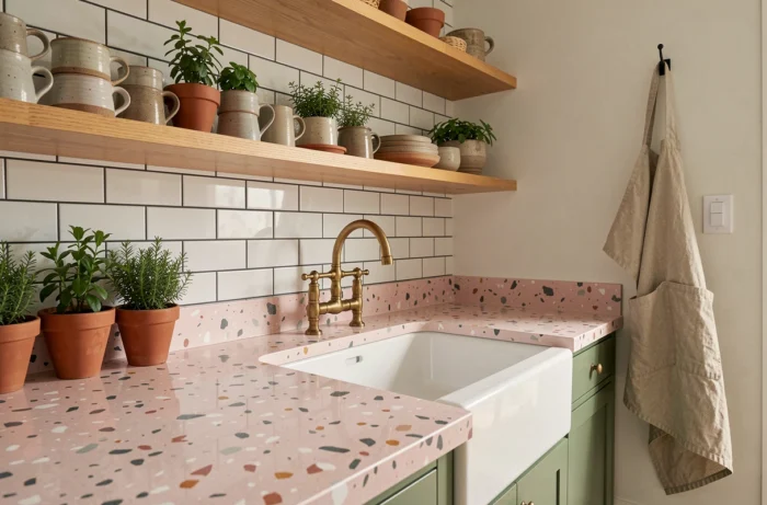
- In the kitchen, a high-resistance vinyl floor imitating terrazzo provides a less expensive alternative to real terrazzo, with simplified maintenance
The 2026 decor trend is distinguished by a technical guiding thread: each choice of color, material, or covering is evaluated based on its longevity. An interior that ages well, where surfaces patina instead of degrading, represents the true marker of this season. This approach requires more thought upfront but reduces the desire to redo everything two years later.